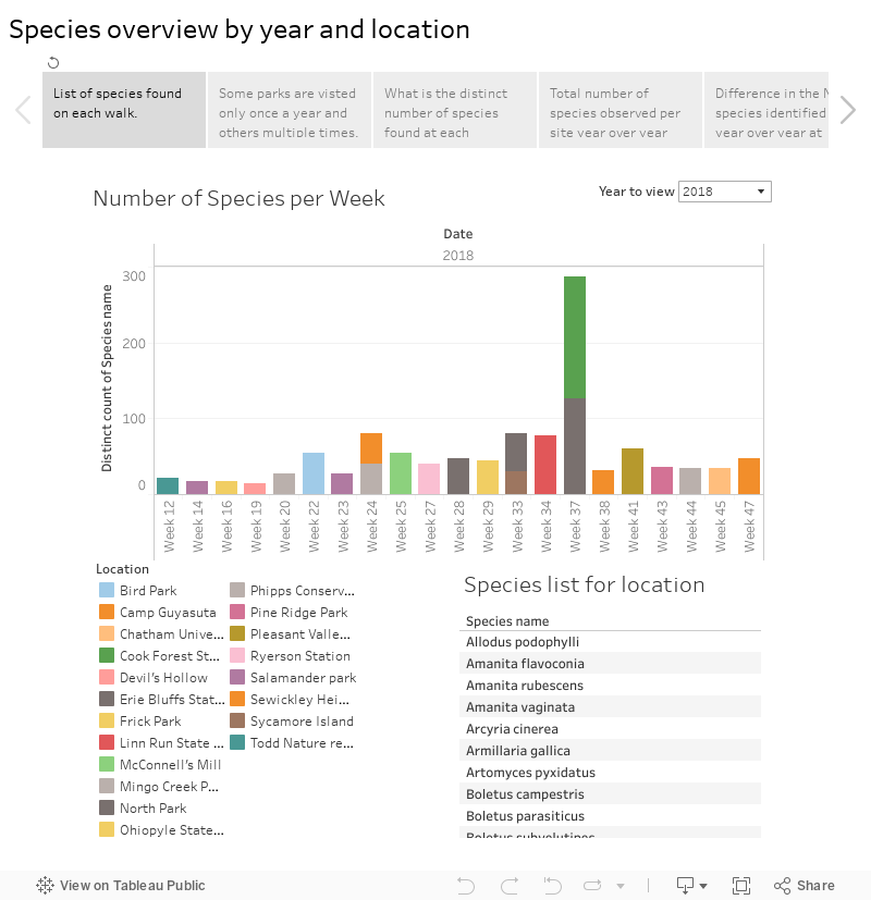
For just over two years we have been collecting and publishing the species lists collated at the end of every walk, foray and some meetings on our website. This visualization takes the static lists and tries to do something a bit more interactive and interesting with the data. You can still see how many and which species were identified on each walk. We have also plotted the data on to maps so that we have an idea of the numbers of species observed or identified per park or area. Original development was by Richard Jacob.
Three new graphs were developed by Patricia Houck. These graphs cover the “Total number of species year over year”, the “Difference in the No species identified year over year at location” and the “Number of distinct locations for each species”.
Note that the all the graphs are interactive and for example you can sort the species by the number of locations where they have been found to get an indication of prevalence. A complete description of each graph will follow in a future update.
We plan to add a few more graphs to the report in the future and will also add in all the historic data over time.
If you would like to use the Tableau file with data from your own club please let us know and we will send you a template.
Recent Comments